Add a page
A weekly overview from scratch: a header, a habit tracker, two columns of
day boxes. Along the way: containers, fill weights, the debug overlay.
Start a document
Create templates/weekly.yaml:
document: weekly

page:
  size: [105, 170]
  margins: {top: 2.5, bottom: 7.5, inner: 15, outer: 5}

grid:
  module: 2.5
  dots: {spacing: 5, origin: [0, 2.5]}

decorations:
  - {type: rule, edge: inner, offset: 5}

templates:
  plan:
    side: right
    content:
      - type: fields
        columns: [{label: WEEK OF}]
pages: [plan]
Run journalkit watch --png in a second terminal. It rebuilds on every save,
so you can keep out/weekly-01-plan.png open in a viewer that reloads.
A heading and a habit grid
Add to content:
      - type: heading
        text: HABITS
      - type: habit_grid
        headers: [M, T, W, T, F, S, S]
        habits: [Move, Read, "", ""]
        label_width: 35
        row_height: 5
A blank habit gets a rule to write on. The grid works out its height from
the number of rows, so it needs no height.
Two columns of days
content is a stack. For columns, nest a row with a stack in each:
      - type: row
        height: fill
        gap: 5
        gap_between: 2.5
        content:
          - type: stack
            gap_between: 2.5
            content:
              - {type: box, label: MON, height: fill}
              - {type: box, label: WED, height: fill}
              - {type: box, label: FRI, height: fill}
          - type: stack
            gap_between: 2.5
            content:
              - {type: box, label: TUE, height: fill}
              - {type: box, label: THU, height: fill}
              - {type: box, label: "SAT / SUN", height: fill, flex: 2}
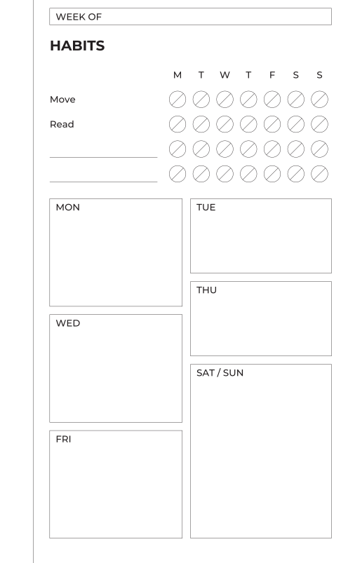
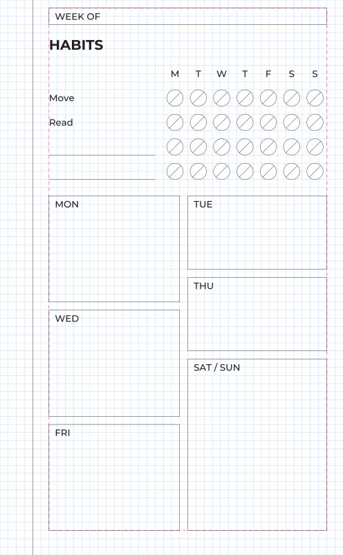
--debug.The row takes the remaining height and sits 5 mm below the habit grid
(gap is the space before a module). The two stacks split the width. Inside
each, the boxes split the height by flex: the weekend box has weight 2, so
it is twice the height of TUE and THU. Shares are rounded down to the grid
and the remainder goes to the last box, so the column ends exactly on the
margin.
To see the grid, build once with the overlay:
Blue lines are the module grid, the pink dashed box is the content area.
Every module edge is on a blue line. journalkit check asserts the same
thing without drawing.
The verso
Add a second template and page:
templates:
  plan:
    # …
  notes:
    side: left
    content:
      - type: heading
        text: NOTES
      - type: lines
        height: fill
        spacing: 7.5
pages: [plan, notes]
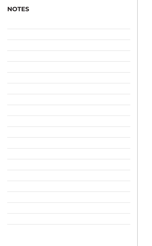
The rules are 7.5 mm apart, three grid steps, so they line up with anything else on the page.
journalkit build with no arguments now renders both documents. Next:
write a module.