Modules
Every entry in a template's content is a module. journalkit modules
prints the same list from the installed version, including any types your
project adds.
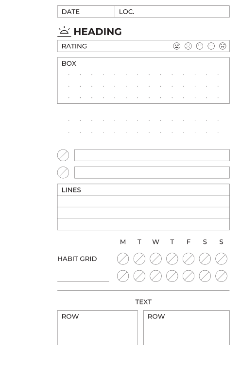
fields, heading, rating, box, dotfield, checklist, lines, habit_grid, rule, text, and a row of two boxes.Lengths are millimetres unless suffixed. Any value may be a $theme.<path>
reference.
Common keys
Accepted by every module, handled by the layout engine:
| key | |
|---|---|
type |
the module type; required |
height |
length, or fill; default: the module's intrinsic height, else fill |
width |
inside a row: length or fill |
gap |
space before this module; default defaults.gap |
flex |
weight among sibling fill modules; default 1 |
valign |
inside a row: top, middle, bottom |
theme |
mapping merged over the page theme for this module |
id |
free text, ignored |
Modules that draw a frame also accept stroke and stroke_width overrides.
box
A bordered writing area with an optional top-left label and dot grid. No intrinsic height.
| parameter | default | |
|---|---|---|
label |
small-caps label in the top-left corner | |
dots |
false |
true, or a mapping overriding radius, colour, inset, spacing, origin |
border |
true |
true, false, "top bottom", ["left", "right"] — which sides to stroke |
background |
none |
fill colour behind the box |
radius |
0 |
corner radius |
stroke, stroke_width |
theme | border colour and weight |
- {type: box, label: NOTES, height: fill, dots: true}
- {type: box, height: 6}                       # one unlabelled writing line
- {type: box, border: "top bottom", height: 10}
dotfield
box with the frame off: a bare dot grid. Same parameters; border
defaults to false.
fields
A single framed row divided into labelled cells. Intrinsic height 5 mm.
| parameter | default | |
|---|---|---|
columns |
list of labels, or mappings {label, width}; columns without width share what is left |
|
height |
5 |
row height |
dots |
false |
dot grid inside the row |
border |
true |
as for box |
heading
A section title, optionally preceded by an icon. Intrinsic height 7.5 mm.
The icon sits in a fixed-width box at the left (theme.heading.icon_box) so
headings with and without icons share a text origin; text is centred on its
cap height.
| parameter | default | |
|---|---|---|
text |
the heading | |
icon |
icon name | |
height |
7.5 |
slot height |
rule |
false |
draw a hairline under the heading |
size |
theme.heading.size |
font size |
align |
left |
left, center, right |
colour |
theme.heading.colour |
text and icon colour |
icon_height |
theme.heading.icon_height |
drawn icon height |
rating
A labelled row with a run of icons at the right edge. Intrinsic height 5 mm.
| parameter | default | |
|---|---|---|
label |
left-hand label | |
icons |
explicit list of icon names | |
icon + count |
prefix and count: icon: mood, count: 5 is mood-1 … mood-5 |
|
icon_size |
theme.rating.icon_size |
icon height |
icon_gap |
theme.rating.icon_gap |
space between icons |
height |
5 |
row height |
checklist
Rows of a marker plus a writing box. Intrinsic height from the rows.
| parameter | default | |
|---|---|---|
rows |
5 |
number of rows |
row_height |
5 |
|
row_gap |
2.5 |
space between rows |
marker |
theme.marker.shape |
circle, circle-slash, square, none, icon:<name> |
marker_size |
theme.marker.size |
marker box size |
marker_gap |
theme.checklist.marker_gap |
space between marker and box |
labels |
list of labels, one per row | |
border |
true |
border of the writing boxes, as for box |
dots |
false |
dot grid inside the writing boxes |
habit_grid
A habit tracker: one labelled row per habit, one marker per column. Intrinsic
height from the rows (plus a header row if headers is given). A blank habit
gets a rule to write on instead of a label.
| parameter | default | |
|---|---|---|
habits |
list of row labels; "" for a blank row |
|
columns |
7 |
number of marker columns |
headers |
list of column headings, e.g. [M, T, W, T, F, S, S] |
|
label_width |
25 |
width of the label gutter |
row_height |
5 |
|
row_gap |
module grid | space between rows |
label_gap |
module grid | clearance between the label gutter and the first column |
cell |
fills the remaining width | column width |
marker |
theme.marker.shape |
as for checklist |
marker_size |
row_height |
marker diameter |
- type: habit_grid
  headers: [M, T, W, T, F, S, S]
  habits: [Move, Read, "", ""]
  label_width: 42
  row_height: 4
lines
A writing area ruled with horizontal lines. No intrinsic height.
| parameter | default | |
|---|---|---|
spacing |
theme.lines.spacing |
line spacing |
first |
spacing |
offset of the first rule from the top |
border |
false |
frame around the area, as for box |
label |
top-left label | |
inset |
0 |
horizontal inset of the rules from the edges |
colour |
theme.lines.colour |
|
opacity |
theme.lines.opacity |
Rules are drawn while y stays inside the rect, so the last rule is never on
the bottom edge.
rule
A single hairline across the module's rect. Intrinsic height one grid step.
| parameter | default | |
|---|---|---|
orientation |
horizontal |
or vertical |
position |
center |
start, center, end — where in the rect |
inset |
0 |
shortens the line at both ends |
dash |
SVG dash pattern, e.g. "1 1" |
Also the usual choice for a decoration.
text
A line of free text. Intrinsic height one grid step; the text is centred on its cap height within the rect.
| parameter | default | |
|---|---|---|
text |
the string | |
style |
label |
label or heading: which theme block supplies size, weight, colour |
align |
left |
left, center, right |
size |
style's | font size |
weight |
style's | font weight |
spacer
Empty space. Intrinsic height one grid step; height: fill pushes everything
after it down.
row
Lays its children out side by side. Children size on width; a child
shorter than the row is placed by its valign.
| parameter | default | |
|---|---|---|
content |
list of child modules | |
gap_between |
defaults.gap |
horizontal gap between children |
padding |
0 |
inset applied before laying children out |
height |
tallest fixed child, else fill |
stack
Stacks its children vertically — a template's content is an implicit
stack. Same parameters as row, with gap_between vertical. A stack with a
fill child is itself elastic.